Home and Decor
5 min read
The Psychology of Color: How Your Home’s Palette Affects Your Mood and Productivity
February 10 , 2025
By Sienna Claire

Color is more than just a design choice—it influences our emotions, energy levels, and overall well-being. Whether you want a calming bedroom, an energizing kitchen, or a productive home office, choosing the right colors can transform your space and mindset. Here’s how different hues affect mood and productivity, along with expert tips on incorporating them into your home decor.
Understanding Color Psychology in Home Decor
The science of color psychology suggests that different hues trigger different emotional responses. By strategically using colors, you can enhance relaxation, boost productivity, or create a more inviting and social atmosphere in your home. Beyond just wall colors, the shades in your furniture, décor accessories, and lighting can also play a key role in shaping the ambiance of your living space.
1. The Power of Blue: Serenity & Focus
Blue is known for its calming and soothing effects, making it ideal for bedrooms and workspaces. Lighter shades promote relaxation, while deeper blues encourage concentration and mental clarity. Research has shown that blue tones can lower blood pressure and heart rate, reducing stress levels and enhancing focus.
Best for: Bedrooms, bathrooms, home offices
Pair with: White, soft grays, or natural wood tones for a balanced look.
Decor Tip: Introduce blue elements through textiles such as curtains, rugs, and bedding for a subtle yet effective touch.
2. Energizing Yellow: Creativity & Positivity
Yellow evokes happiness, creativity, and warmth. It’s perfect for spaces where you need a mood boost, such as kitchens and home offices. A splash of yellow can make a space feel more inviting and lively, ideal for inspiring productivity and innovation.
Best for: Kitchens, dining rooms, creative workspaces
Pair with: Neutrals or soft blues to prevent overwhelming the space.
Decor Tip: Use yellow in accent pieces like throw pillows, artwork, or statement furniture to brighten up a neutral room.
3. Calming Green: Balance & Renewal
Green is associated with nature, balance, and relaxation. It’s a great choice for spaces where you want to feel grounded and refreshed. Studies suggest that green can improve reading ability and reduce eye strain, making it an excellent option for home offices and reading nooks.
Best for: Living rooms, bedrooms, home offices
Pair with: Earthy tones like beige, brown, and soft grays.
Decor Tip: Incorporate houseplants for a natural, refreshing feel that enhances the color’s calming effects.
4. Passionate Red: Energy & Warmth
Red is bold and stimulating, often linked to passion and high energy. While it can be too intense for bedrooms, it works well in social areas, sparking conversation and appetite. Red is often used in restaurants for this very reason!
Best for: Dining rooms, entryways, accent walls
Pair with: Whites, warm neutrals, or deep blues for contrast.
Decor Tip: If painting an entire room red feels too intense, try incorporating red through artwork, cushions, or tableware.
5. Tranquil Purple: Luxury & Creativity
Purple combines the calmness of blue with the energy of red, making it ideal for luxurious, creative spaces. Lighter shades like lavender enhance relaxation, while deep purples add drama and elegance. Purple is often associated with spirituality and mindfulness.
Best for: Bedrooms, meditation spaces, artistic areas
Pair with: Metallics, soft grays, or deep jewel tones.
Decor Tip: Opt for velvet fabrics and ornate lighting to enhance purple’s luxurious feel.
6. Grounding Neutrals: Simplicity & Versatility
Neutrals like beige, gray, and taupe create a timeless and adaptable backdrop for any space. They provide balance and allow accent colors to shine. Neutral colors make a room feel grounded and harmonious, making them perfect for those who love minimalist aesthetics.
Best for: Any room in the home
Pair with: Almost any color for a harmonious look.
Decor Tip: Layer different shades of neutrals through rugs, throws, and furniture to add depth and warmth to the room.
7. Refreshing White: Clean & Minimalist
White promotes a sense of purity, openness, and simplicity. It reflects light, making small spaces feel larger and brighter. White can also create a peaceful atmosphere, perfect for those who prefer a clutter-free and airy aesthetic.
Best for: Small rooms, modern spaces, Scandinavian-inspired decor
Pair with: Natural wood, soft pastels, or bold accent colors.
Decor Tip: Use textured white fabrics and warm lighting to prevent the space from feeling too stark or clinical.
Lighting’s Role in Color Perception
The way colors appear in your home isn’t just dependent on paint swatches—it’s also influenced by lighting. Natural daylight shows colors in their truest form, while warm-toned lighting can soften cooler hues. When choosing colors, consider how your room’s lighting will affect the final look.
The colors you choose for your home can shape your emotions, productivity, and overall well-being. Whether you prefer calming blues, energizing yellows, or grounding neutrals, using color psychology in your decor will help you create a space that enhances your lifestyle. The key is to experiment with shades and find what resonates best with your personal style and needs.
Which color are you most drawn to? Let us know in the comments!
live smarter
Shop smarter, live better, and stay ahead of the trends with our reliable recommendations!
Fashion
2 min read
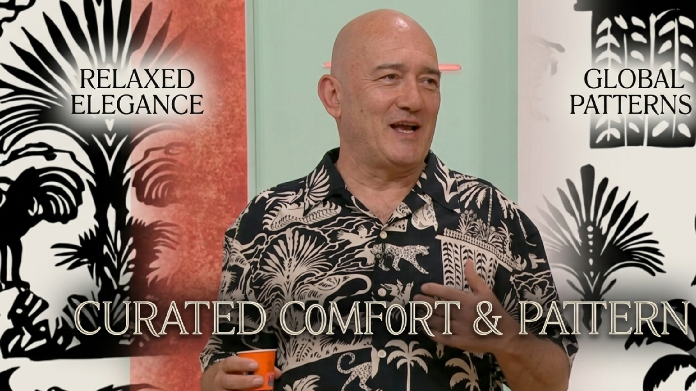
How to Refresh Your Vacation Wardrobe with the A Nossa Tarde 2026 Jose Raposo Printed Resort Shirt

Health and Beauty
7 min read
The Subscription Trap: How the Average User Loses $300+ Per Year Without Realizing It


trending
Health and Beauty
6 min read
True Nature Meats Custom Bundle Builder Review: Build a Premium Meat Box That Fits Your Lifestyle
Fashion
2 min read
How to Refresh Your Golf Style with the Jae Bowers 2026 Women’s PGA Championship Polo Shirt
Gadgets and Tech
7 min read
Upgrade Your Ride with Flashark Racing: Performance Parts That Actually Make a Difference
Home and Decor
11 min read
How Smart Pet Technology Is Changing the Way We Care for Cats at Home
Travel
7 min read
Topoak Rooftop Tents Review: Galaxy Pro vs Stellar (Galaxy 2.0) vs Nebula X‑Frame
Fitness and Sports
7 min read